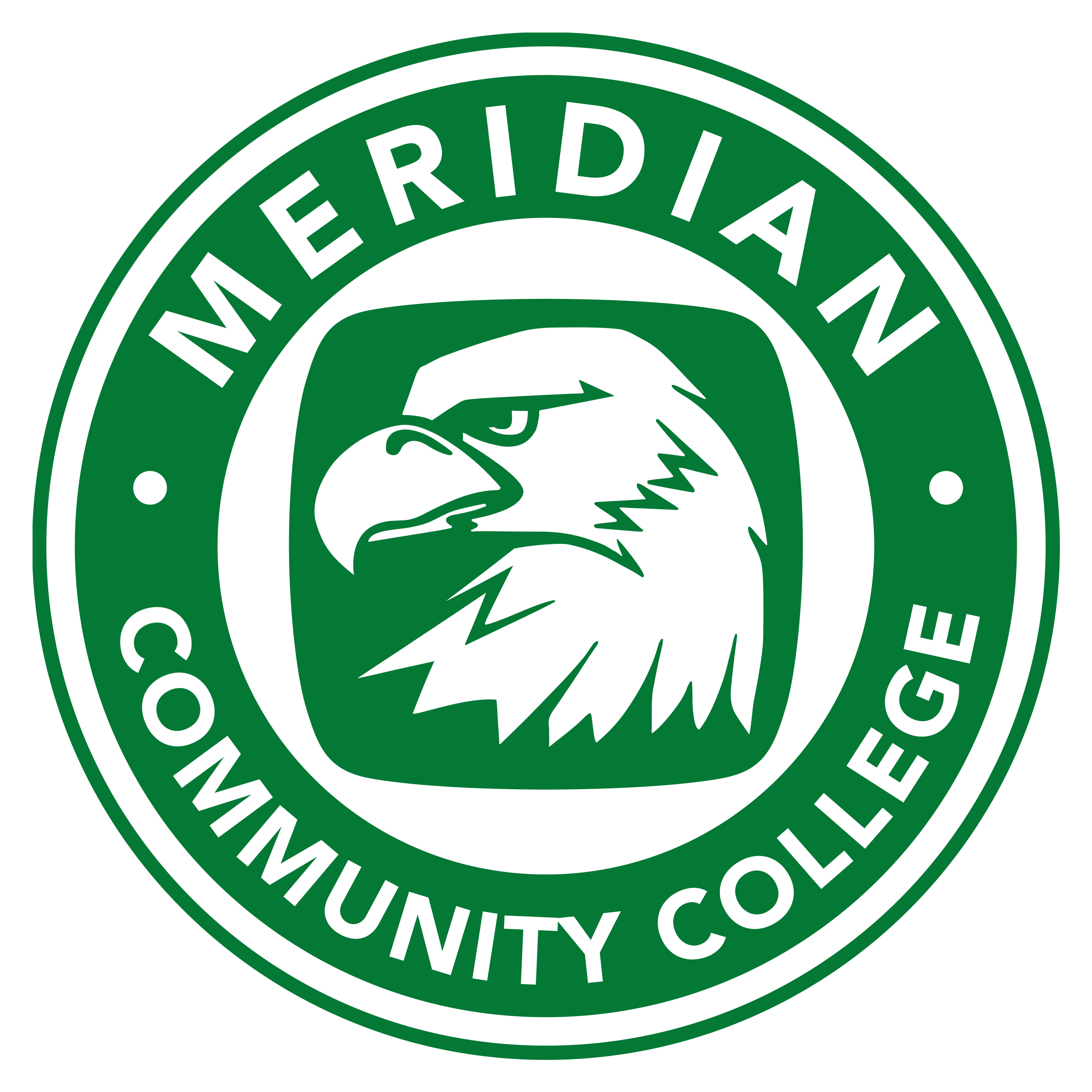
MCC Logos
The Meridian Community College logo is an outward expression and representation of the institution. The wordmark logo is the College’s major identifying element in any type of visual communication to any audience. The typography is a modern typeface and is organized in a decidedly contemporary style. This use of style elements from the original logo with the updated font and color accurately reflects the college’s respect for the past and its vision for the future.
The wordmark is the default visual identity for the majority of applications, from electronic media (websites, videos, PowerPoint®, etc.) to printed publications and advertising. The official College logo will be used on all stationery, including letterhead, envelopes and business cards, as well as in other official capacities.
To ensure that all uses of the wordmark will be consistent in quality, no effort should be made to recreate, to use photocopies or scans from this guide, or to manipulate or change the marks in any way. Alteration includes re-creating or redrawing the logo or adding effects to the surface of the logo with computer graphics or word processing programs.
- Note: The preferred logo for the college is the rooftop word mark and must be used whenever possible.
![]()
![]()
![]()
![]()
![]()
![]()
![]()
![]()
![]()
![]()
![]()
![]()
![]()
![]()
![]()
![]()
![]()
![]()
![]()
![]()
![]()
![]()
![]()
![]()
![]()
![]()
![]()
![]()
![]()
![]()
![]()
![]()